Seen

Seen
Digital Agency Services
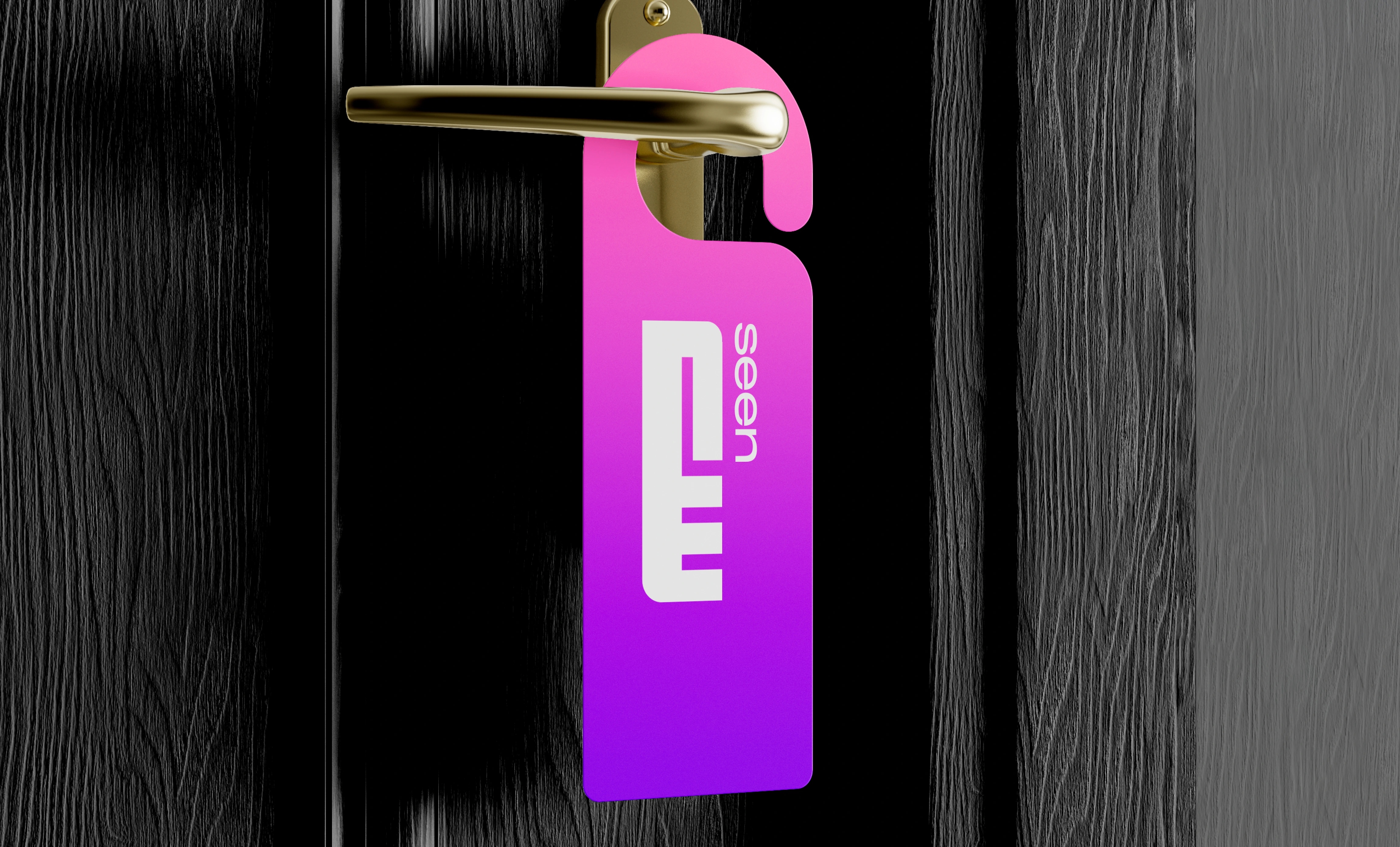
Seen is a concept identity built for the future of immersive tech. The aim: design a brand system that feels bold, modern, and unmistakably futuristic.
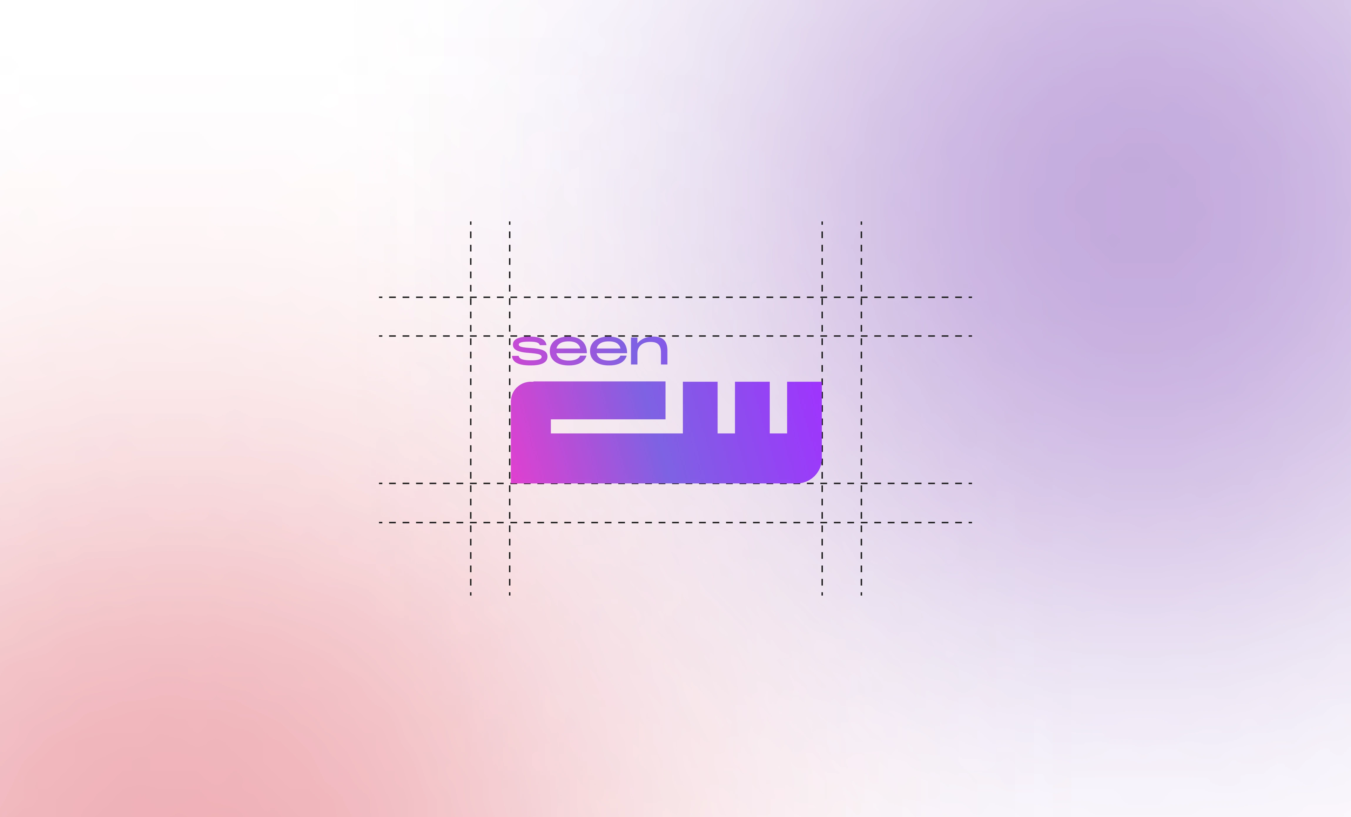
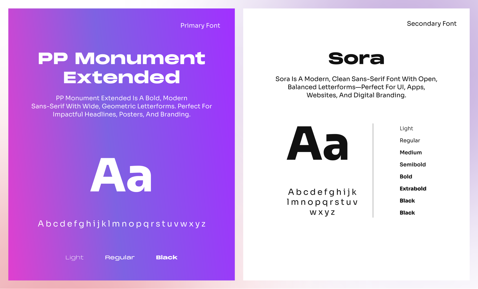
The wordmark uses PP Monument Extended, a confident geometric sans, paired with Sora in lighter weights for supporting text. Together they strike a balance between authority and clarity. A spectrum of blue-violet gradients anchors the look, supported by crisp black and white foundations for maximum contrast.
The system is grid-driven and scalable. From tiny favicons to billboards in city centers, every asset holds its presence. Typography stays sharp, colors stay dynamic, and layouts remain structured to project both confidence and edge.
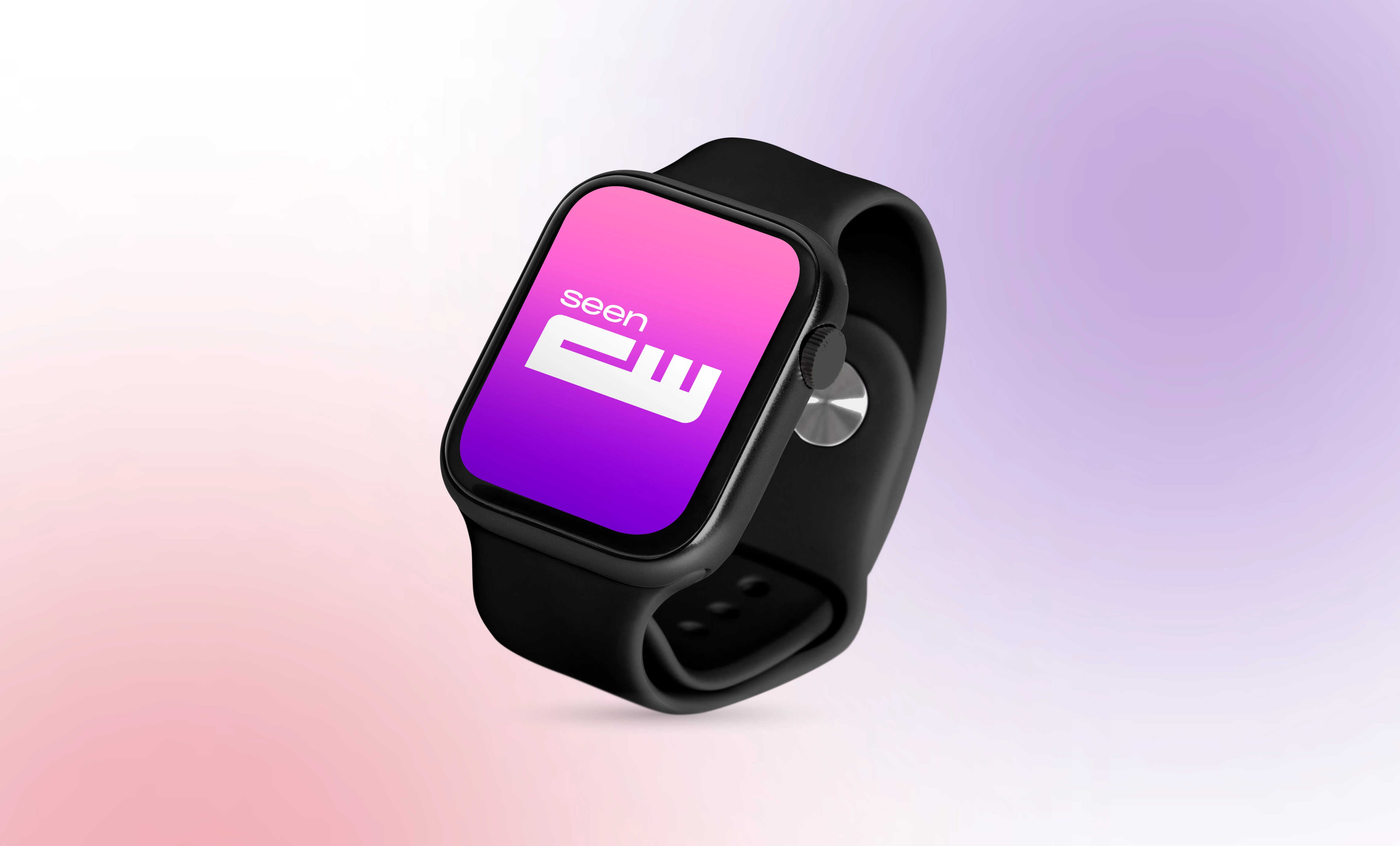

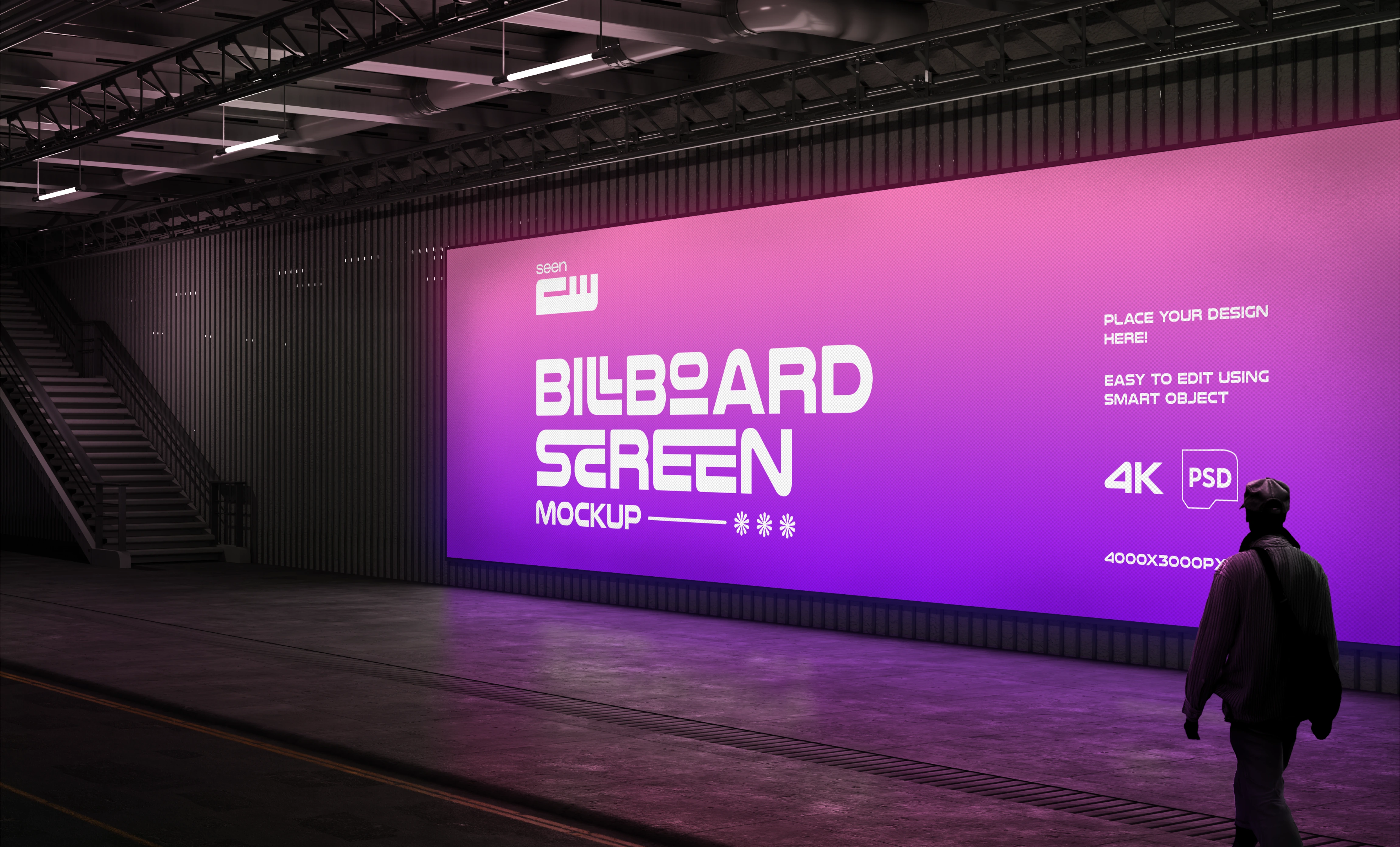
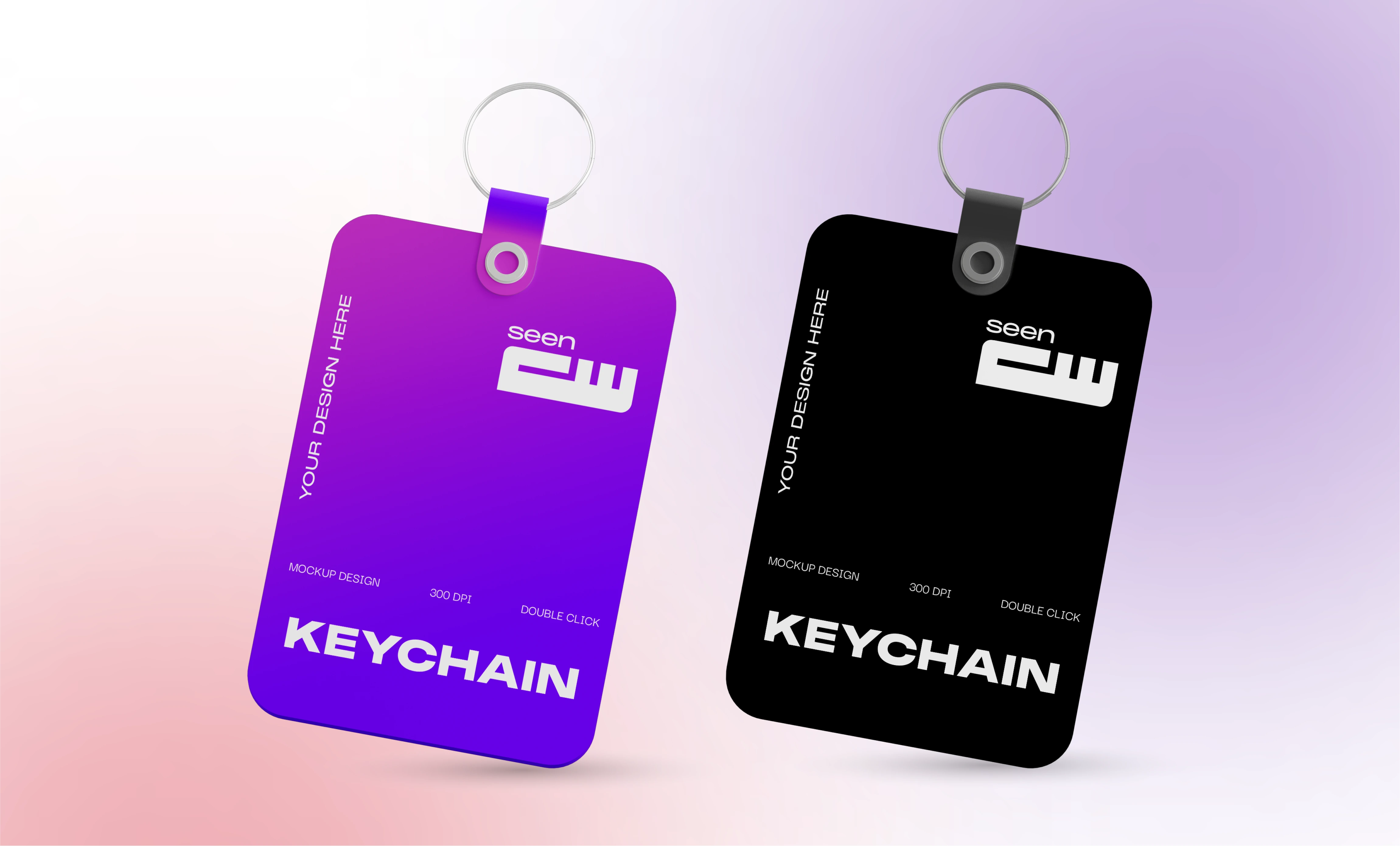
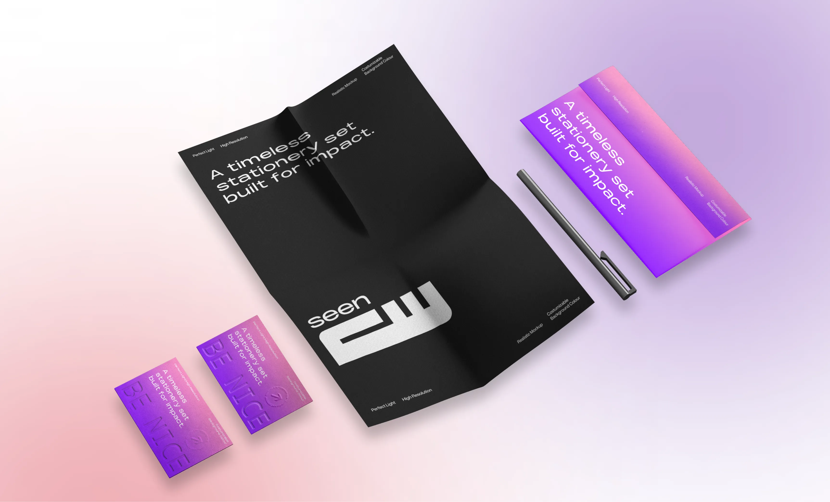
Applications span across digital and physical touchpoints: stationery, signage, packaging, wearable accents, and keychains. Gradient-driven backdrops and geometric iconography extend the visual language while keeping it cohesive.
The result is a flexible identity that communicates clarity, energy, and innovation. A brand built to be seen.


Fantastic team to work with! They kept me updated, delivered on time, and the quality of work was excellent. Definitely recommend them.

Sntrix went above and beyond to ensure my campaign was a success. Their strategies are practical, effective, and tailored to my business.

Really happy with the service! Sntrix was quick to respond, open to feedback, and made sure everything was done perfectly. Couldn’t ask for more.

Sntrix handled my project with great professionalism. They understood my vision right away and delivered exactly what I wanted. Smooth and hassle-free experience.

I’ve worked with several agencies before, but Sntrix stands out for their dedication. They don’t just deliver results—they make sure you feel supported every step of the way.

Sntrix provided excellent value for money. They customized their services to fit my needs and always responded quickly to my messages. Genuine people to work with.

Quick, efficient, and effective! I was impressed by their ability to understand my business goals and create a strategy that actually worked. Highly recommend.

The Sntrix team exceeded expectations. Not only did they help me gain more leads, but they also taught me valuable tips along the way. Very professional and approachable.

Working with Sntrix was one of the best business decisions I’ve made. They delivered results on time, stayed transparent throughout, and made sure I was completely happy.

Great job! Sntrix helped me redesign my campaign strategy, and I immediately saw a positive shift in customer engagement. Friendly team and reliable service.

I appreciate how patient and professional the team at Sntrix was. They listened to my concerns and provided solutions that actually worked. Very satisfied with their service.

Amazing experience working with Sntrix. They paid attention to every detail and made the whole process stress-free. My website traffic has noticeably increased.

Sntrix really transformed my brand’s online visibility! They understood exactly what I needed and delivered beyond expectations. Communication was smooth and the results were better than I imagined.

Handled a tight deadline with incredible speed. Filled in the blanks where our brief fell short and got the environment setup running without a manual. Genuinely impressive work.

We built a landing page with Rashmi and were seriously impressed. Clean design, spot-on branding, and just super easy to work with. Highly recommend.

Saurabh really nailed the vision for my landing page. Exceeded expectations, hit every tweak without missing a beat, and made the whole process feel easy.

This uses the same improved version as above, just attribute to the one who worked on that project.

Nitin always goes the extra mile. Quick to respond and on point with every revision we’ve asked for. Reliable, sharp, and easy to work with.

Saurabh designed 2 websites for our restaurant group. His team checked all the boxes. This team has the patience and expertise to get the job done. They're creative and have great suggestions.

Nitin did an excellent job on my full stack project and provided some of the best development work I've found for a very fair and reasonable price. Will definitely be hiring Nitin again soon in the future. Thank you!